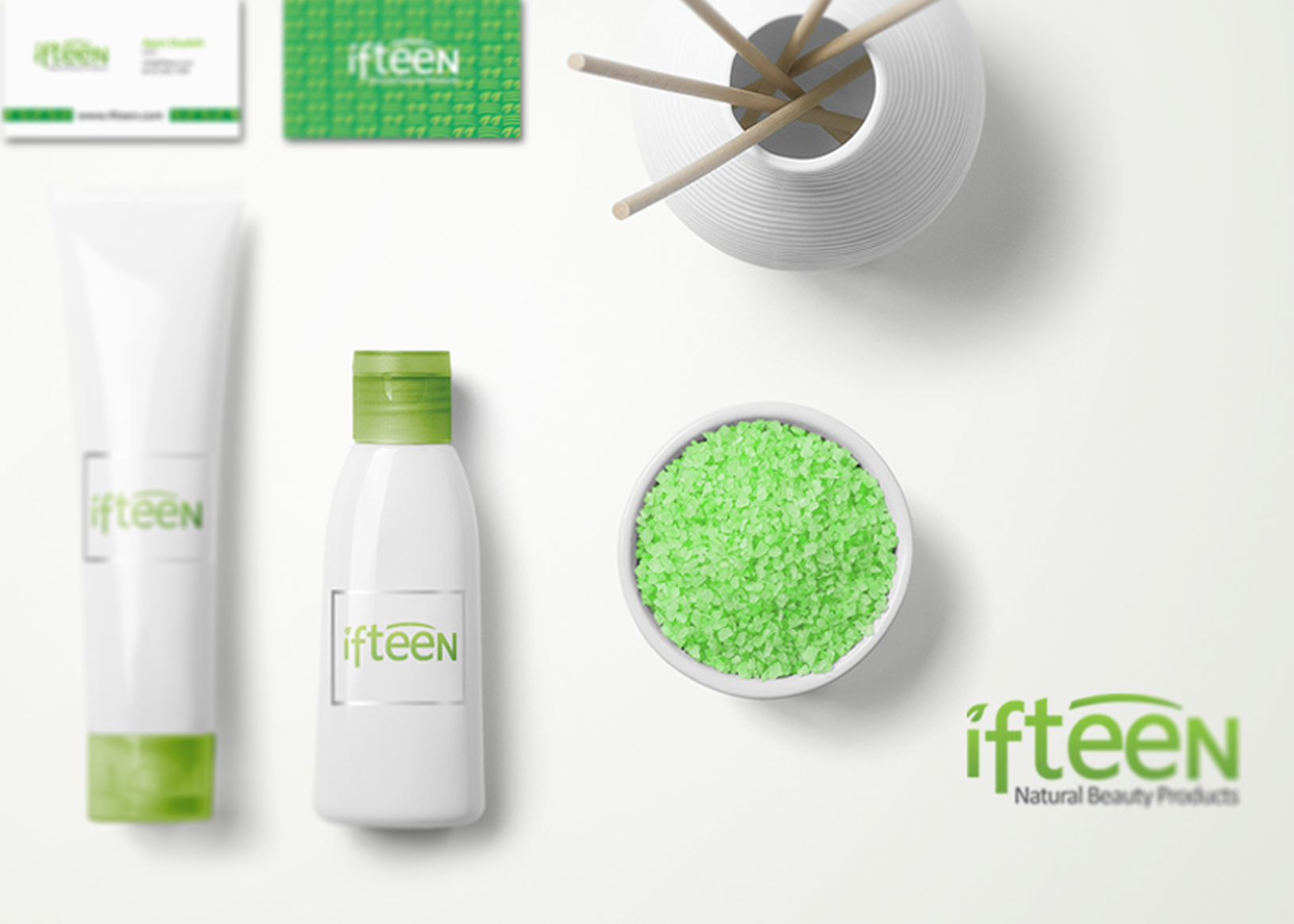
Introducing Ifteen, the Natural Beauty Products Brand! This is another one of my favorite projects so far. My vision my client had for the logo and brand was something that would be simple yet stunning, with nature being highlighted, being one of the core foundations of the brand.
The color palette used was various shades of green for a natural feel and earthiness, as well as white for its purity. There's a couple key elements in the logo such as; the leaf which replaces the dot on the I and the arc which represents a form of radiance which is what the brand promises to deliver.
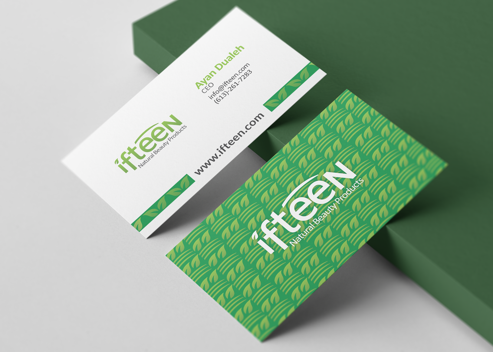
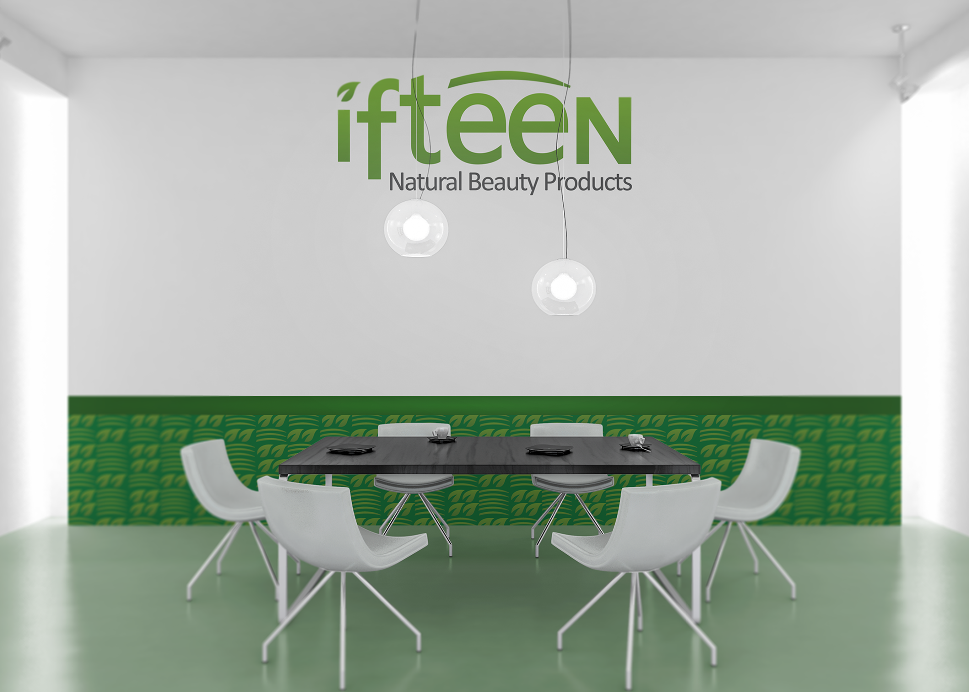
These concept ideas were also presented to the client for what the aesthetics could be.
